


What is Flexbox?
It is a way of aligning your elements in a container in a more systematic way, it helps to fit your divisions in a container with proper space, and alignment.
It provides you with the same functionality provided by positioning property but in more simplified and straightforward way.
So let's start the journey of learning CSS.
Flexbox Properties :
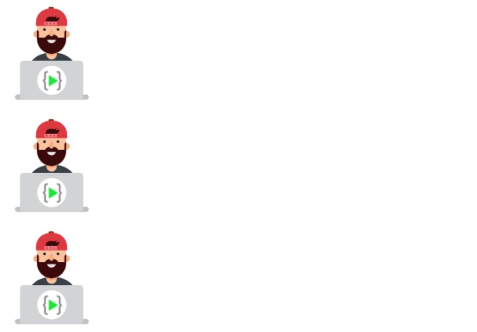
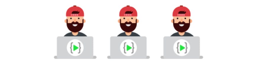
Let's see how our website looks without flexbox.
<!DOCTYPE html>
<html lang="en">
<head>
    <meta charset="UTF-8">
    <meta http-equiv="X-UA-Compatible" content="IE=edge">
    <meta name="viewport" content="width=device-width, initial-scale=1.0">
    <title>Document</title>
</head>
<body>
    <div class="flex-container">
        <div><img src="https://learncodeonline.in/mascot.png" alt=""></div>
        <div><img src="https://learncodeonline.in/mascot.png" alt=""></div>
        <div><img src="https://learncodeonline.in/mascot.png" alt=""></div>
      </div>
</body>
</html>
Output:
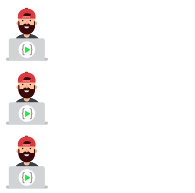
Now let's try adding flex property and see the difference
.flex-container {
  display: flex;
  flex-direction: column;
}
Output:

CSS FLEX CONTAINERS:
Parent Element (Container) :
Like we specified above, this is a flex container (the blue area) with three flex items:

The flex container becomes flexible by setting the display property to flex:
.flex-container {
  display: flex;
}
The flex container properties are:
- flex-direction
- flex-wrap
- flex-flow
- justify-content
- align-items
- align-content
FLEX-DIRECTION
Example:
The column value stacks the flex items vertically (from top to bottom):
.flex-container {
  display: flex;
  flex-direction: column;
}
Output:
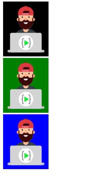
Example:
The column-reverse value stacks the flex items vertically (but from bottom to top):
.flex-container {
  display: flex;
  flex-direction: column-reverse;
}
<div class="flex-container">
      <div><img src="https://learncodeonline.in/mascot.png" alt="" style="background-color: blue;"/></div>
      <div><img src="https://learncodeonline.in/mascot.png" alt="" style="background-color: green;"/></div>
      <div><img src="https://learncodeonline.in/mascot.png" alt=""  style="background-color: black;"/></div>
    </div>
Output:
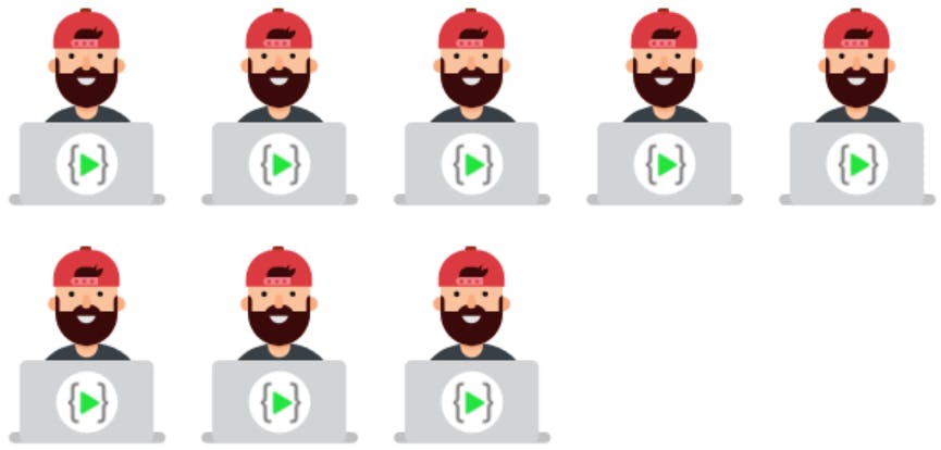
Example:
The row value stacks the flex items horizontally (from left to right):
.flex-container {
  display: flex;
  flex-direction: row;
}
Output:

Example
.flex-container {
  display: flex;
  flex-direction: row-reverse;
}
<div class="flex-container">
      <div>
        <img
          src="https://learncodeonline.in/mascot.png"
          alt=""
          style="background-color: blue"
        />
      </div>
      <div>
        <img
          src="https://learncodeonline.in/mascot.png"
          alt=""
          style="background-color: green"
        />
      </div>
      <div>
        <img
          src="https://learncodeonline.in/mascot.png"
          alt=""
          style="background-color: black"
        />
      </div>
Output:

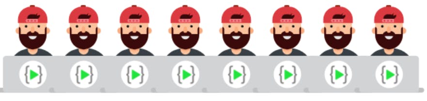
The flex-wrap Property
The flex-wrap property specifies whether the flex items should wrap or not.
The examples below have 8 flex items, to better demonstrate the flex-wrap property.
.flex-container {
  display: flex;
  flex-wrap: wrap;
}
Output :

Example: The nowrap value specifies that the flex items will not wrap (this is default):
.flex-container {
  display: flex;
  flex-wrap: nowrap;
}
Output :
The flex-flow Property
The flex-flow property is a shorthand property for setting both the flex-direction and flex-wrap properties.
.flex-container {
  display: flex;
  flex-flow: row wrap;
}
Output:
The justify-content Property
The justify-content property is used to align the flex items in main axis:
.flex-container {
  display: flex;
  justify-content: center;
}
Example The flex-start value aligns the flex items at the beginning of the container (this is default):
.flex-container {
  display: flex;
  justify-content: flex-start;
}
Example The flex-end value aligns the flex items at the end of the container:
.flex-container {
  display: flex;
  justify-content: flex-end;
}
Example The space-around value displays the flex items with space before, between, and after the lines:
.flex-container {
  display: flex;
  justify-content: space-around;
}
Example The space-between value displays the flex items with space between the lines:
.flex-container {
  display: flex;
  justify-content: space-between;
}
The align-items Property
The align-items property is used to align the flex items.
Example The center value aligns the flex items in the middle of the container:
.flex-container {
  display: flex;
  height: 200px;
  align-items: center;
}
Example The flex-start value aligns the flex items at the top of the container:
.flex-container {
  display: flex;
  height: 200px;
  align-items: flex-start;
}
Example The flex-end value aligns the flex items at the bottom of the container:
.flex-container {
  display: flex;
  height: 200px;
  align-items: flex-end;
}
I have discussed the most commonly used flexbox properties, Hope u have fun reading the article.
Happy Learning 😃
📢 My Social Links